
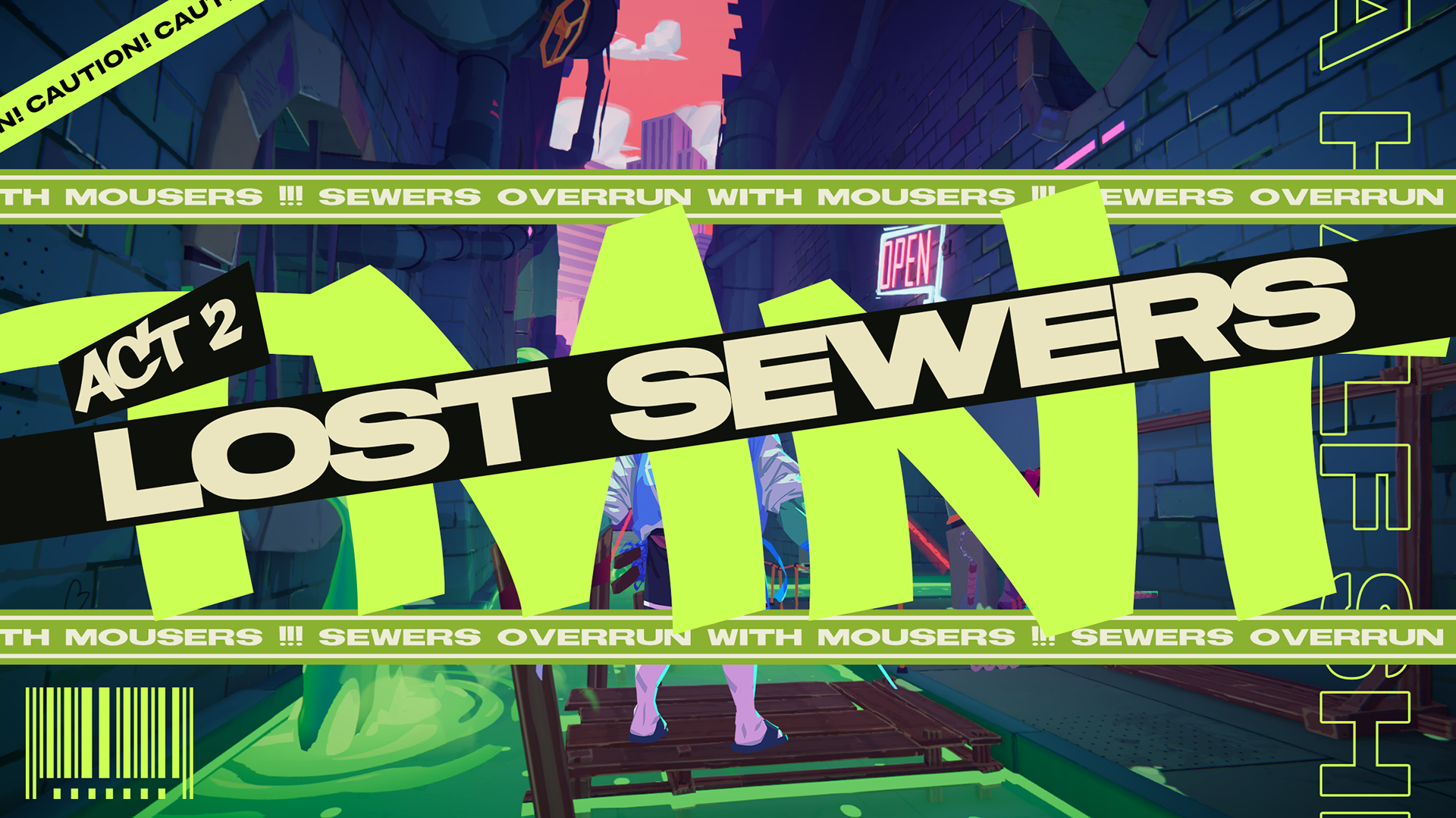
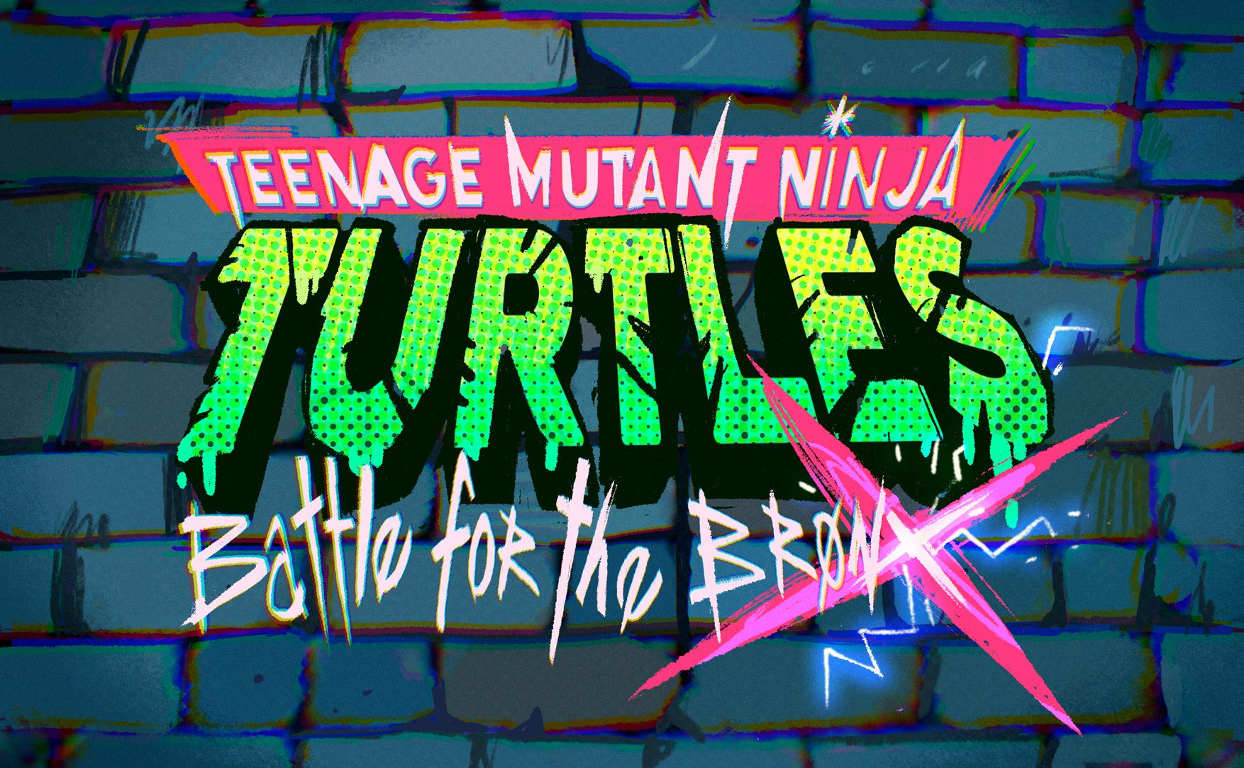
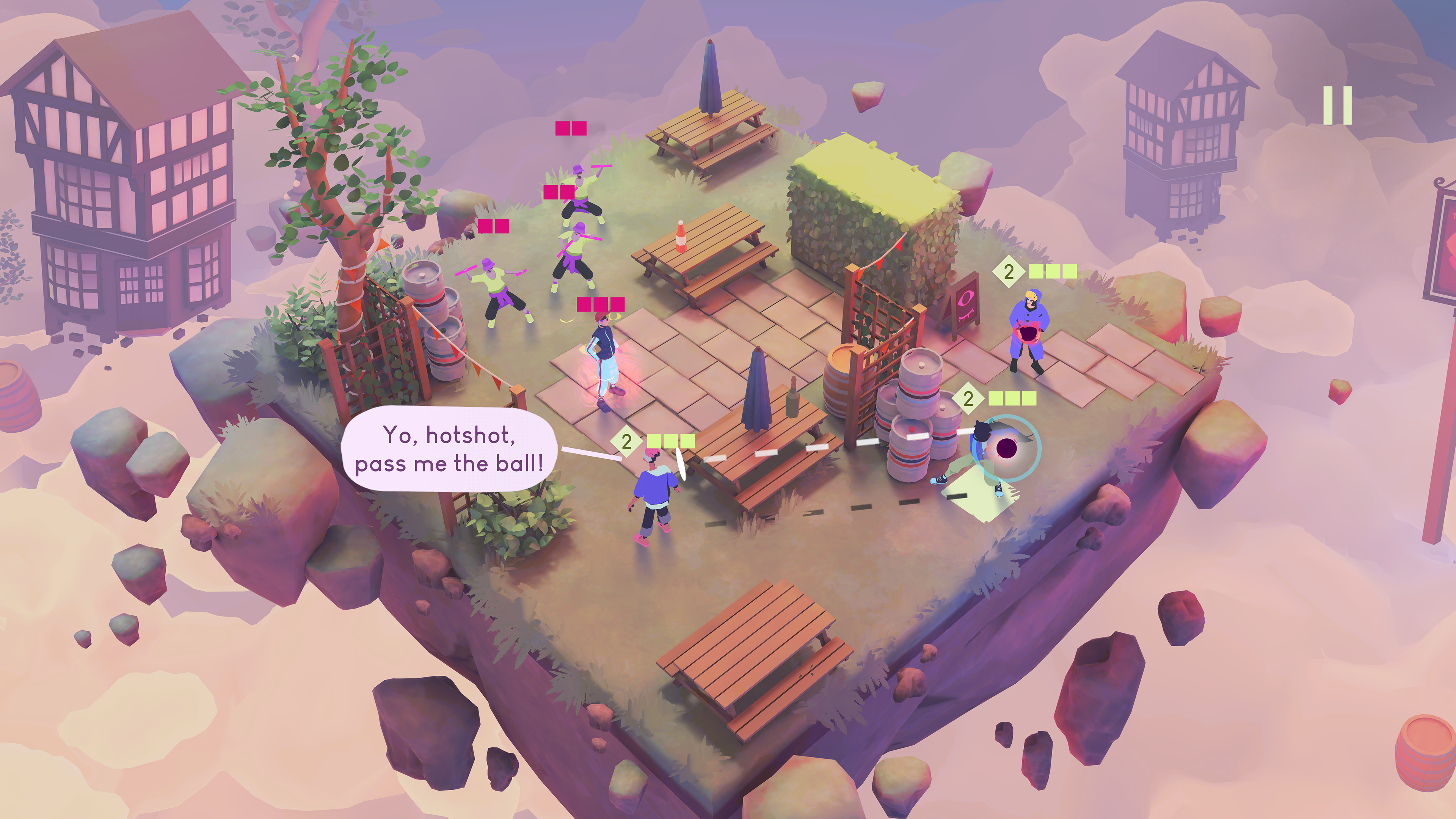
TMNT:BATTLE FOR THE BRONX
RAW ⏾ KINETIC ⏾ LOUD
How do you put a fresh take on a timeless franchise while keeping it slick and frictionless as possible? With Bronx I wanted to go BIG. The graphic design had to brim with electric energy and movement as The Turtles themselves. Every corner of the game needed to drip with a radioactive glow and that kind of 90s toxic ooze energy.
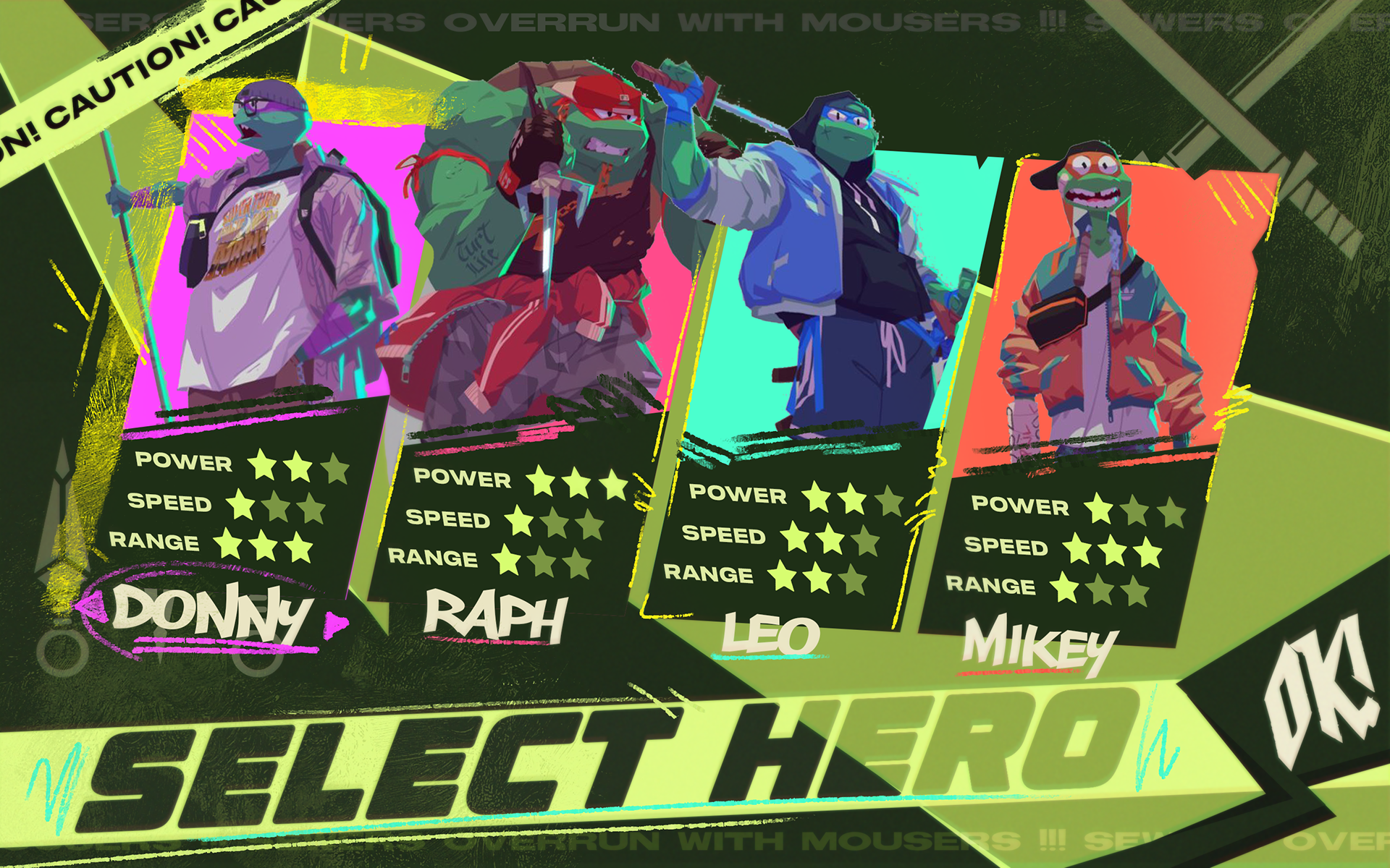
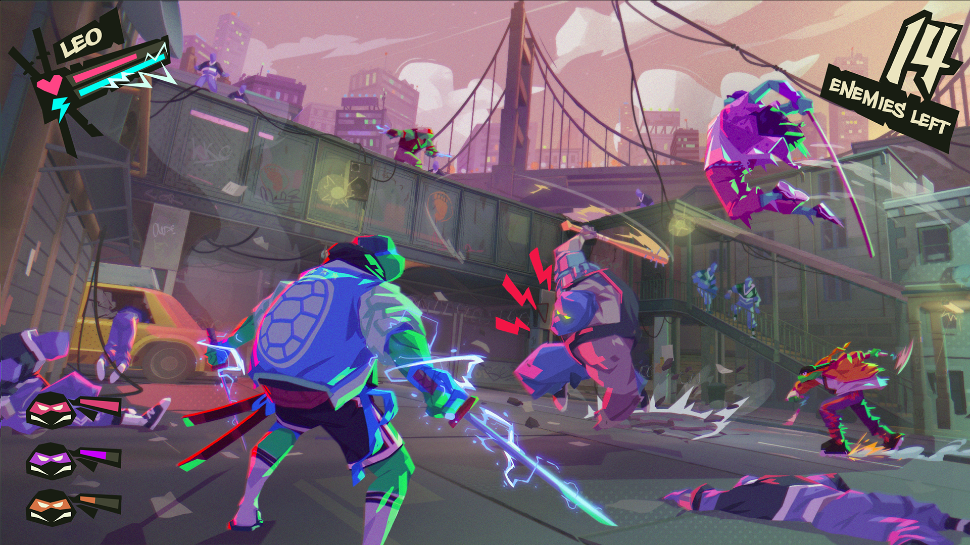
The title screen, character select, everything will look like something you could put up on your wall. The fresh, street style synergising with the gnarly character designs and game world. Hand drawn movement lines crackle and scratch as the player makes selections.

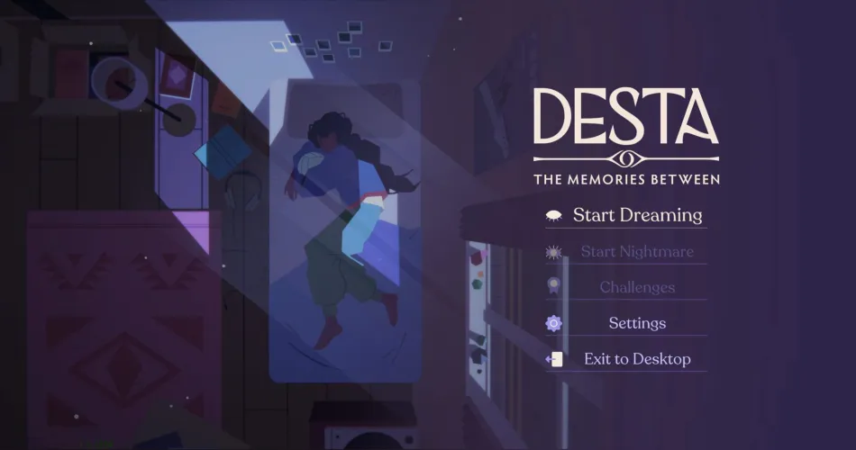
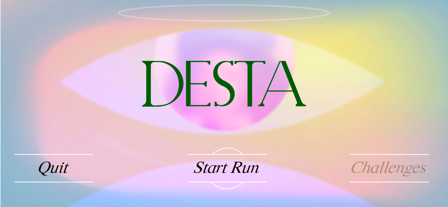
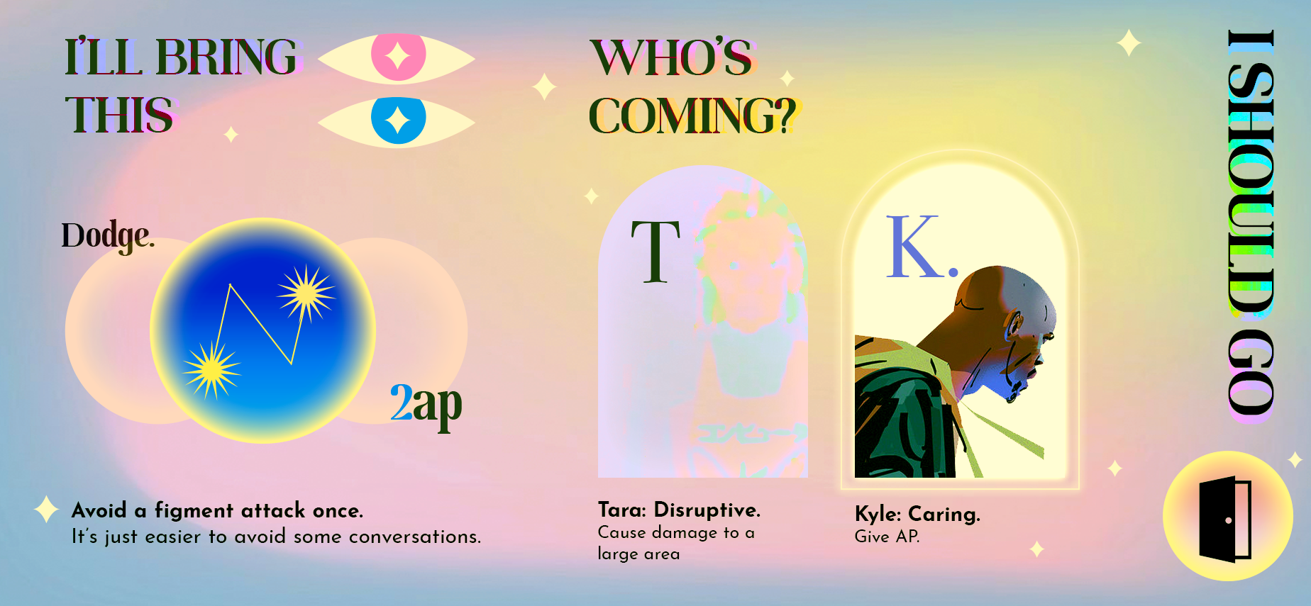
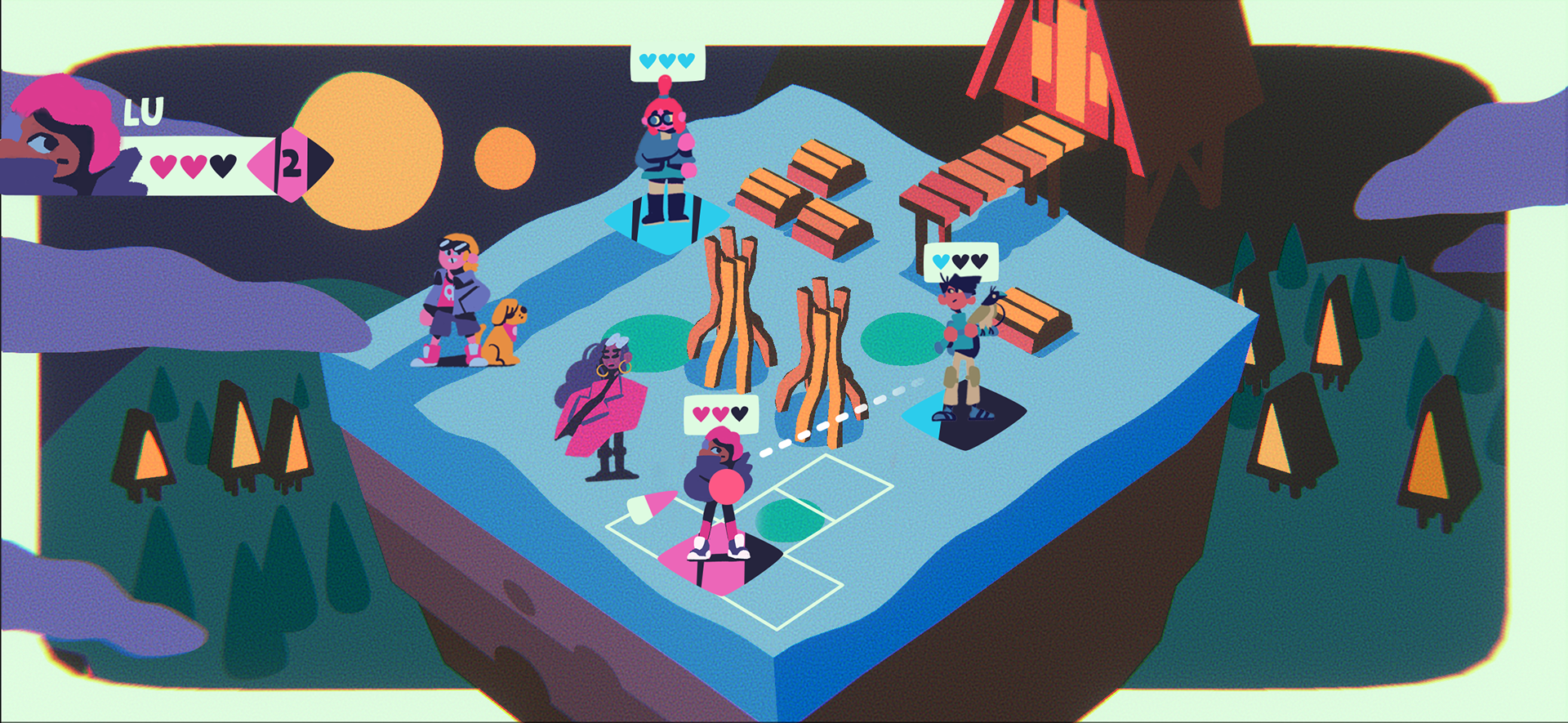
DESTA: THE MEMORIES BETWEEN
SYMBOLIC ⏾ DREAMY ⏾ PRECISE
Desta has a super dreamy and pastel art style. To contrast this but keep the surreal feel I wanted to go for something graphical and clean but retaining that hazy magic. For the UI I brought a hot colour hierarchy to contrast against the more diffused world, Keeping the symbolism and soft shape language also helped dovetail the in-game and UI styles.
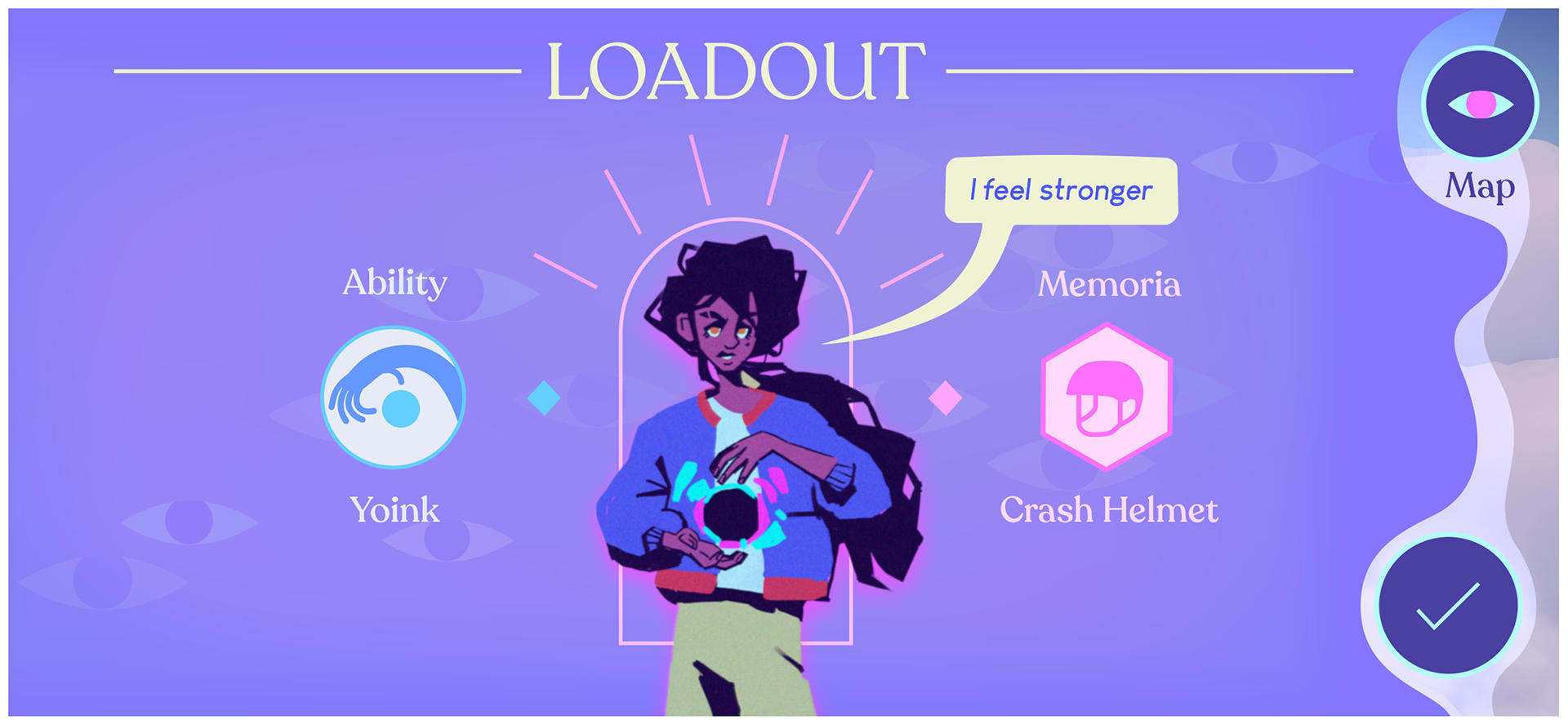
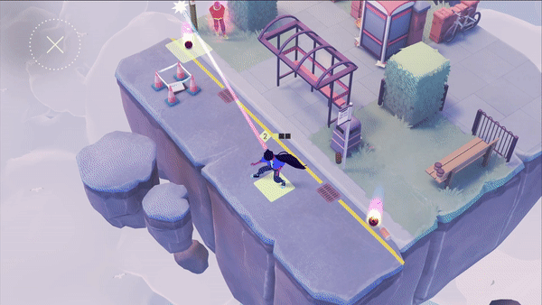
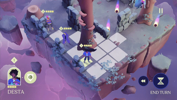
For the gameplay UI I went for something super clean and readable, as everything else on screen has fairly high frequency detail. Simple shapes and neon colours allowed us to keep a relatively minimal style for the UI, rather than having overly complex visual language. For the VFX more bombastic glow and gradient colours helped them stand out.
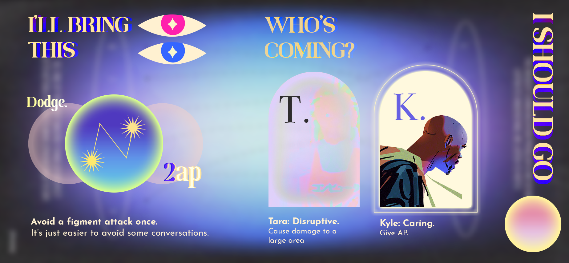
Some of the initial design work was even more dreamlike and surreal, exploring print design approaches to a game UI. In the end we took a cleaner approach but this exploration really helped us define the approach and some of the ideas were taken through to the final game

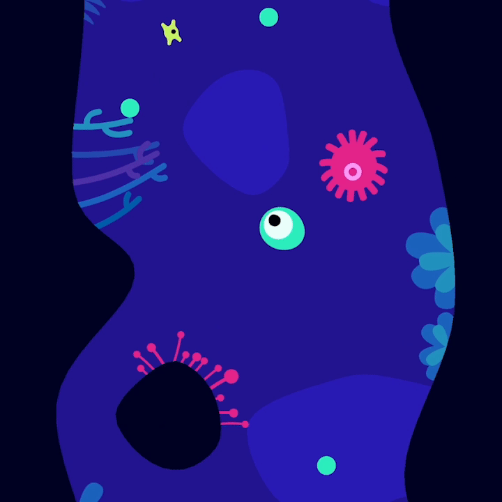
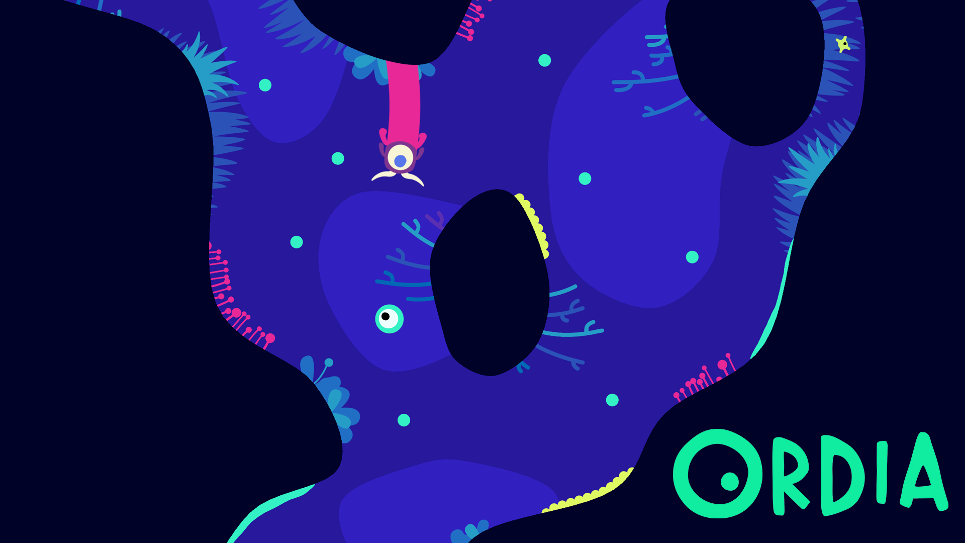
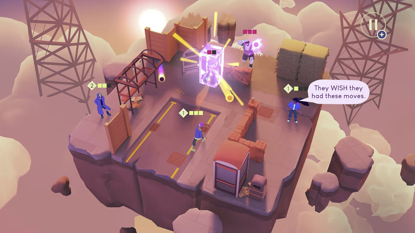
ORDIA
Bouncy ⏾ Clean ⏾ Structured
Our Apple Design Award winning Ordia was a game I really wanted to have a perfect balance of incredibly clean and clear visuals, but still with a playful life to it. While minimal the characters are very much alive and full of personality, subtle eye movements, bouncy goo and organic inspired elements helped bring this approach together.
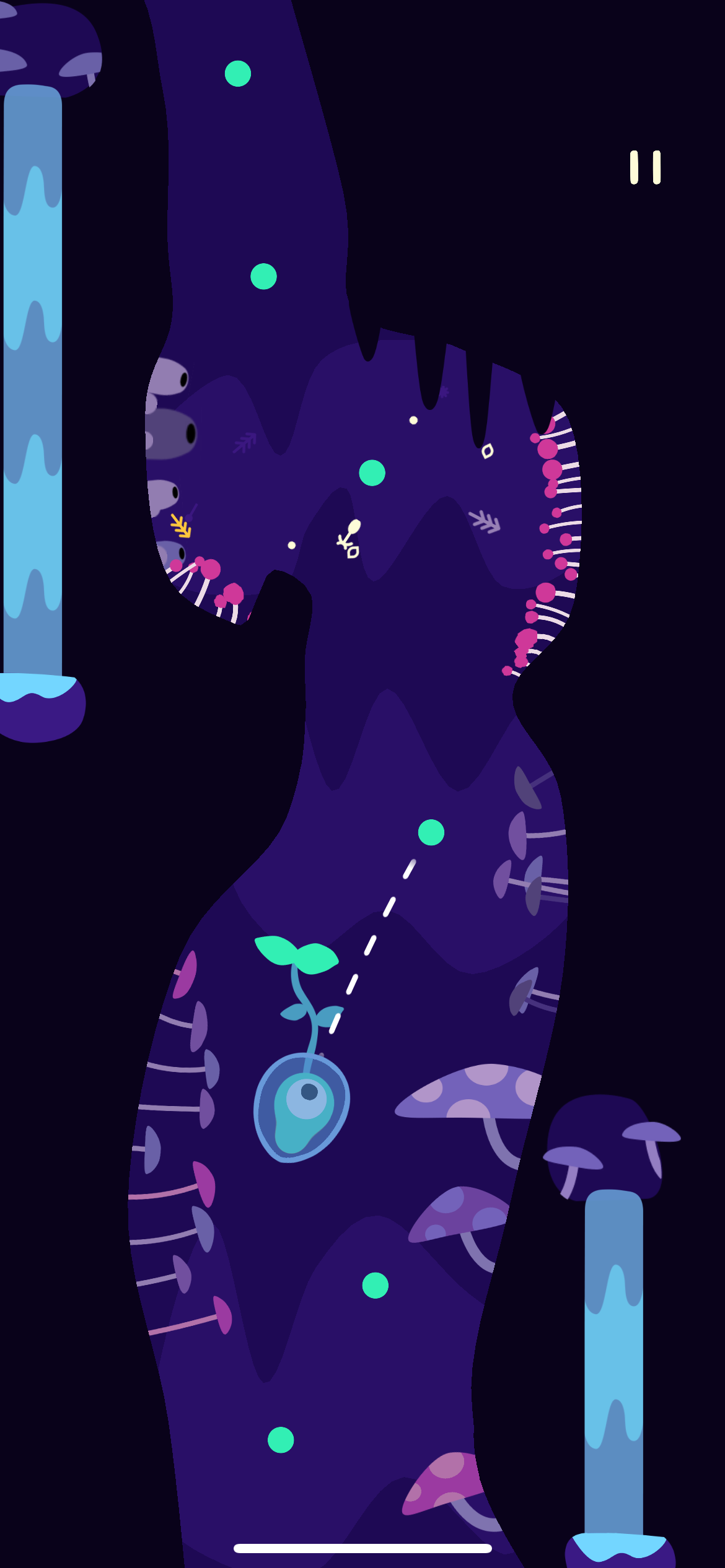
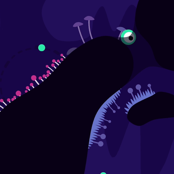
I wanted a super distinct visual hierarchy. You have to know whats safe, what's dangerous and what's useful. An almost traffic like Green for Go, Yellow for Utility and Pink for Danger was used across the game. It allows the player to be quicker and more intuitive in their choices

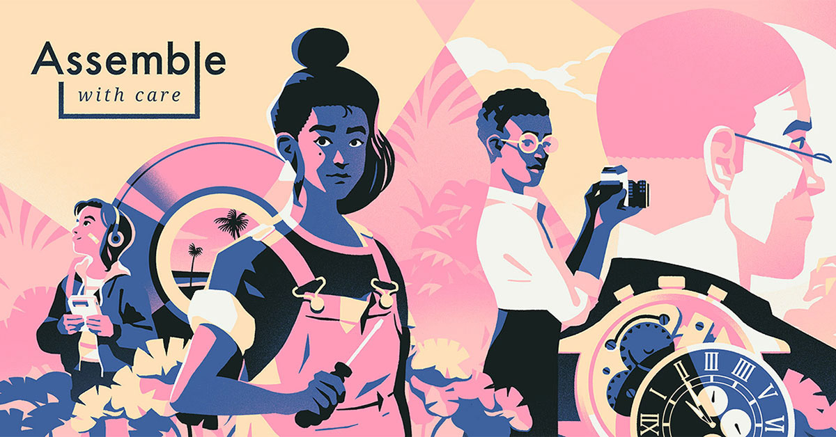
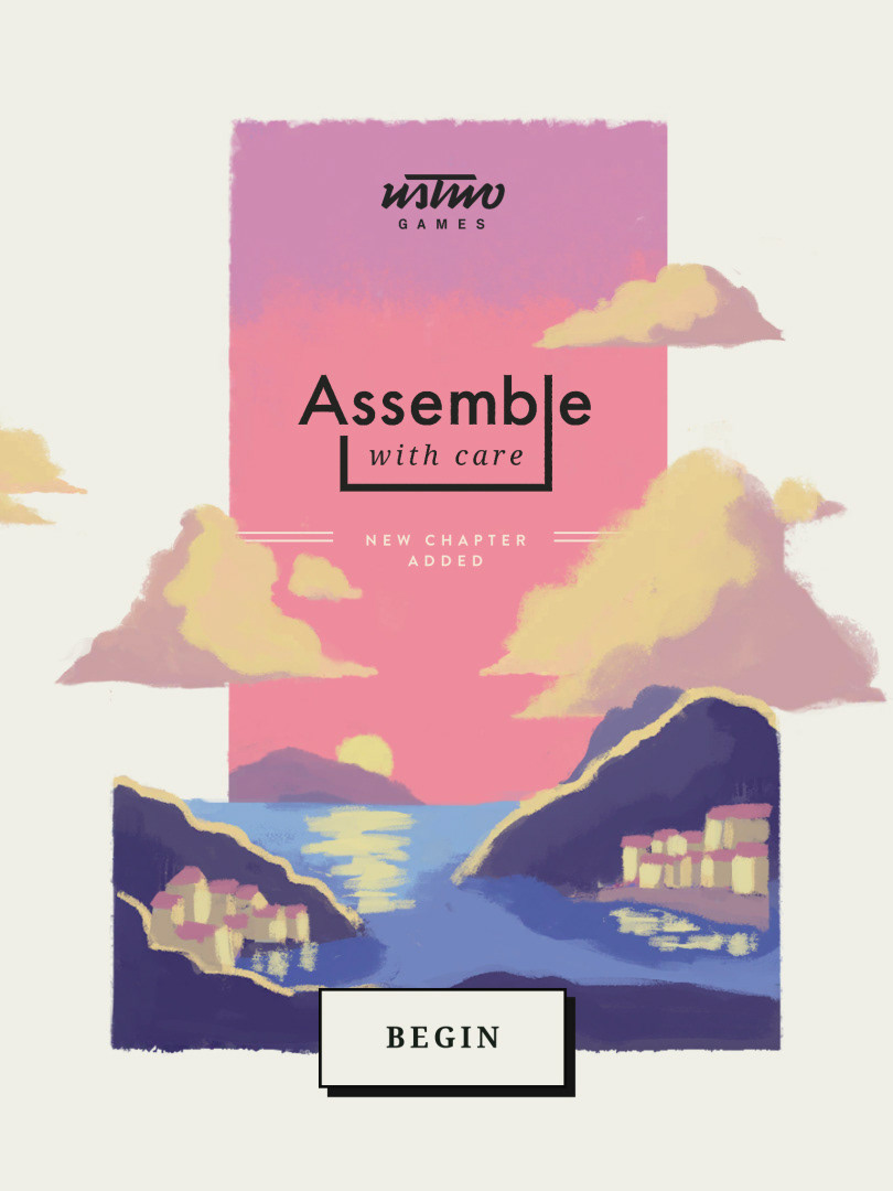
ASSEMBLE WITH CARE
Printed ⏾ COllectible ⏾ Tactile
Assemble with Care was the first game I art directed at Ustwo Games, so I wanted it to have a very distinctive look and feel, especially contrasting against the clean look of Monument Valley. For the gameplay UI I went for a kind of flipbook "boiling" aesthetic, mixed with the kinetic interactions of snapping pieces together we landed a feel which is super tactile.
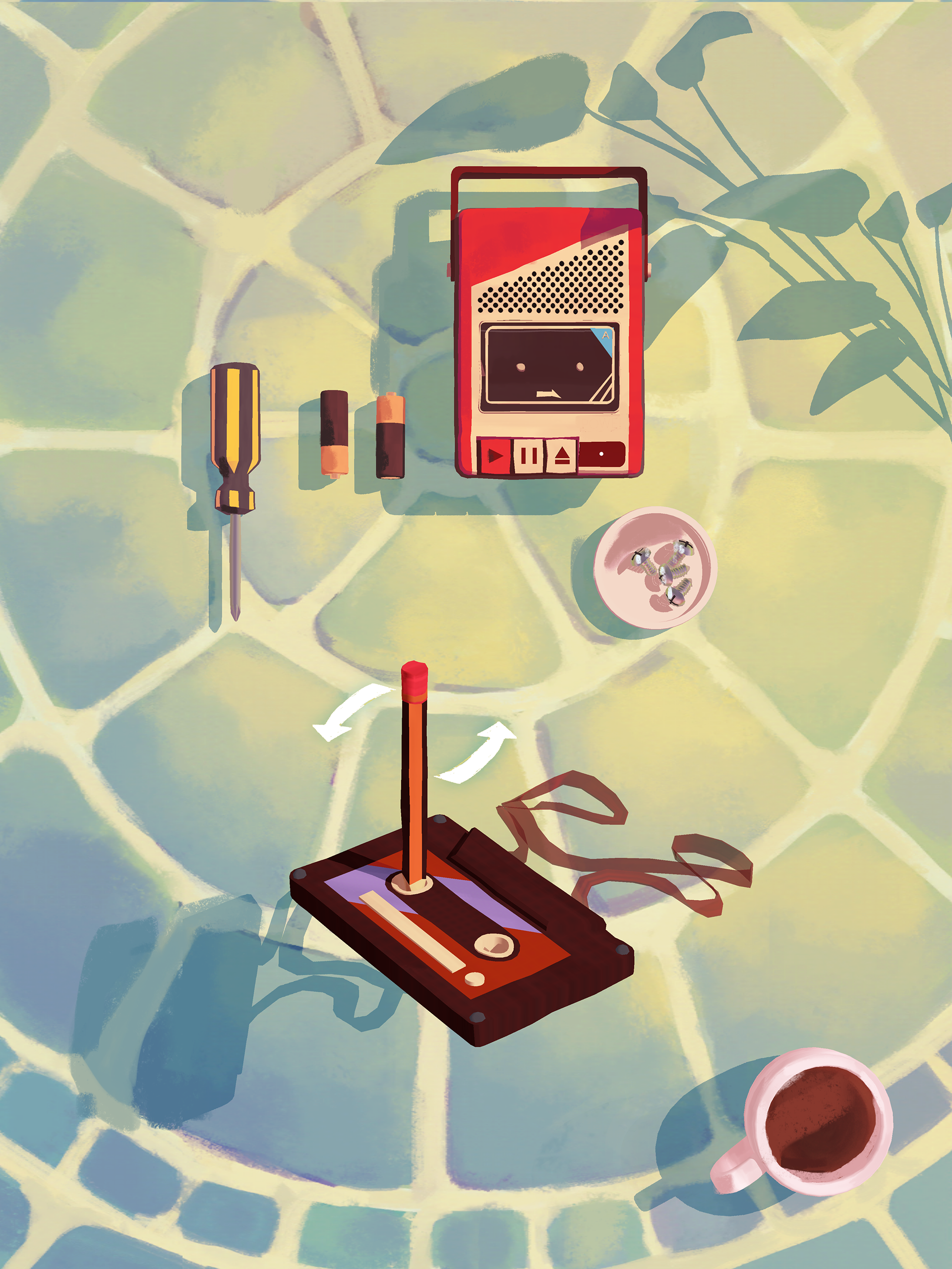
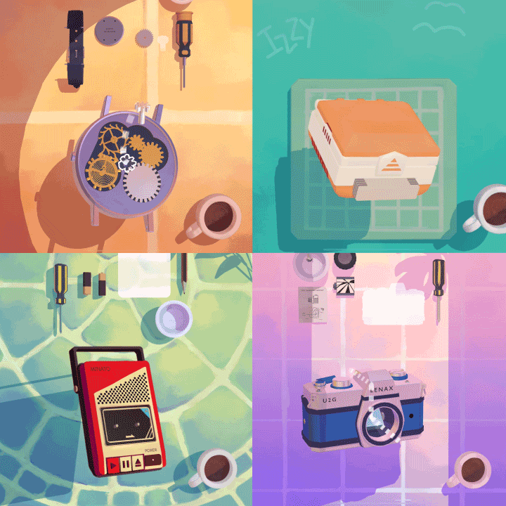
Snappy connection feedback, walking lines to showing the flow of light, subtle symbolism to give the player little clues of what to do next. I wanted all these techniques to work together to give a handmade experience, the result is something our audience simply loved to interact with.
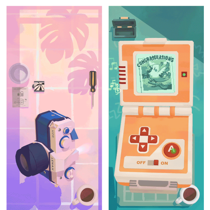
Finally I wanted the framework and menu screens to feel like pieces of print, maybe from an editorial feature or coffee table book. This approach married well with the super tactile gameplay experience and wrapped the game up in something that feels like something you'd hang on your wall.